Back to Dude Intelligence for Education Main Menu
Comparative Maps allow you to compare your results with other schools in a selected geographic location. This data is updated on a monthly basis. For example, if you are viewing your Comparative Maps in March 2017, then you will see data from the first of March 2016 through the end of February 2017.
- Use the Comparative Maps drop down in the top right corner of the screen to change your Map view.
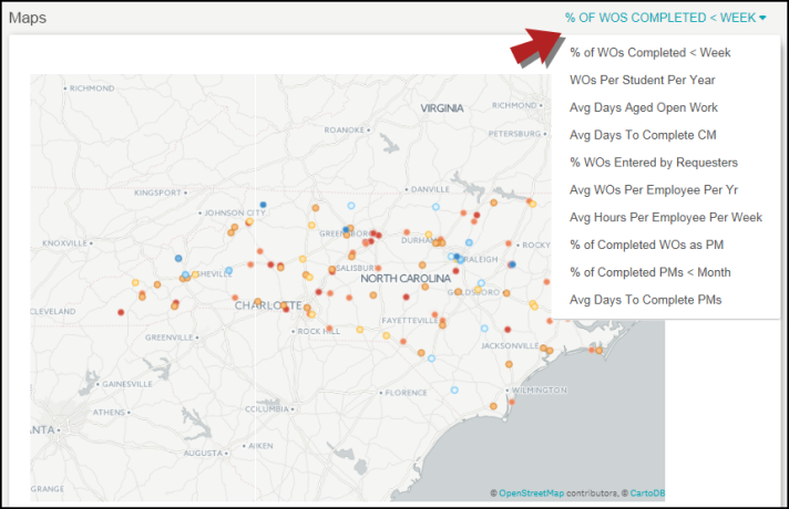
Comparative Maps
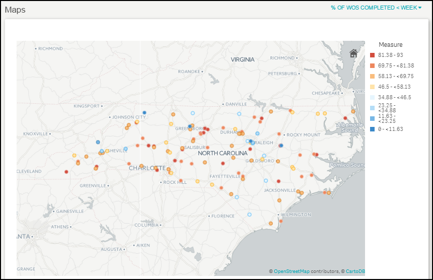
Shows a percentage of work orders completed in less than a week. The colors on the map represent the percentage range of completed work orders as shown in the legend.
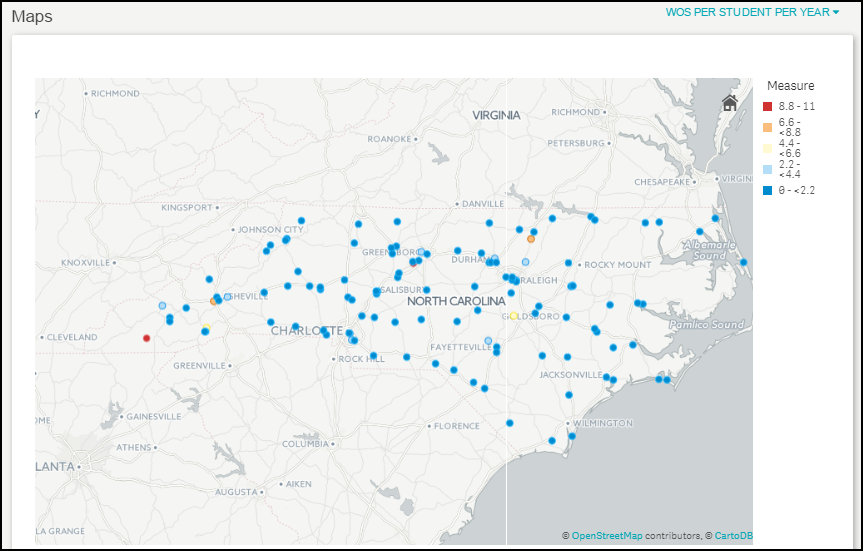
Shows the number of work orders created per student per year. The colors on the map represent the range of work orders as shown in the legend.
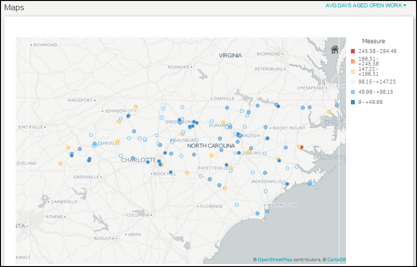
Shows the average days aged of open work orders. The colors on the map represent the average days aged range as shown in the legend.
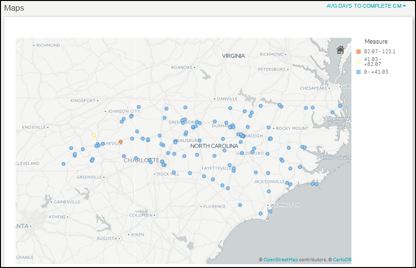
Shows the average number of days it took to complete corrective maintenance work orders. The colors on the map represent the average days aged range as shown in the legend.
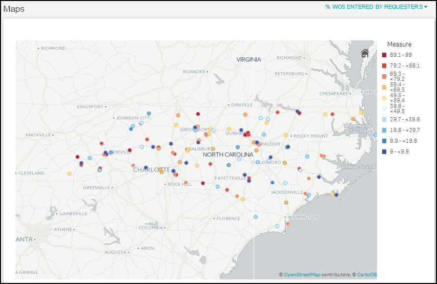
Shows a percentage of work orders entered by Requesters. The colors on the map represent the WO percentage range as shown in the legend.
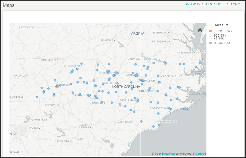
Shows an average number of work orders created per employee per year. The colors on the map represent the work order range as shown in the legend.
Shows an average number of labor hours per employee per week. The colors on the map represent the labor hour range as shown in the legend.
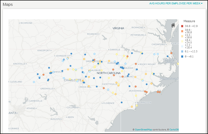
Shows a percentage of completed planned maintenance work orders. The colors on the map represent the percentage range as shown in the legend.
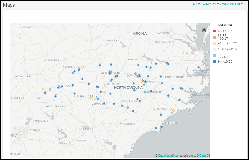
Shows a percentage of planned maintenance work orders completed in less than a month. The colors on the map represent the PM percentage range as shown in the legend.
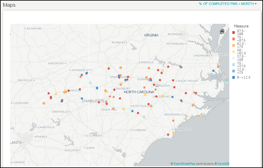
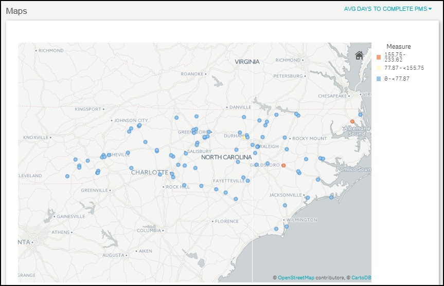
Shows an average number of days it took to complete planned maintenance work orders. The colors on the map represent the average number of days range as shown in the legend.
